Nigel Sutcliffe course review: how I applied what I learned in procreate & watercolor
One weekend this month, I took two online classes by artist Nigel Sutcliffe: A Beginner’s Guide to Color and Painting Expressive Color Studies with a Limited Palette.
Nigel Sutcliffe‘s teaching style is clear and easy to follow. He helped me resolve some long-standing confusion I had regarding color mixing—specifically how to handle light and dark tones within a limited palette. It’s the kind of approach you can put into practice immediately.
In the past, especially with mediums where I mix my own colors, I found it far too easy to simply replicate “realistic” colors. The results usually ended up looking quite ordinary and lacked harmony. After applying Nigel’s methods, I stopped overthinking and started focusing on the pure joy of painting! Experimenting with color palettes using this fundamental logic is honestly addictive. ☺️
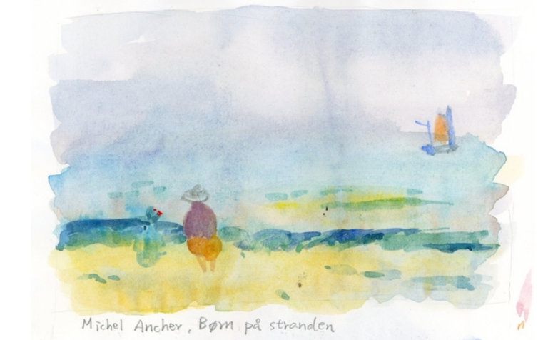
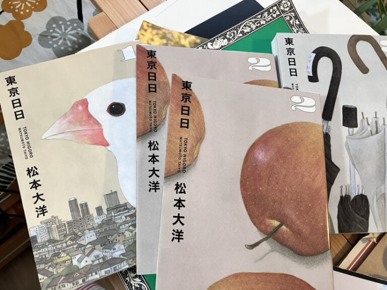
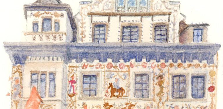
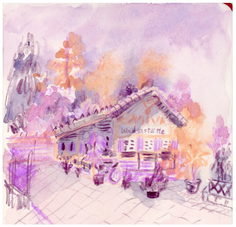
Here are some of my extra practice pieces:
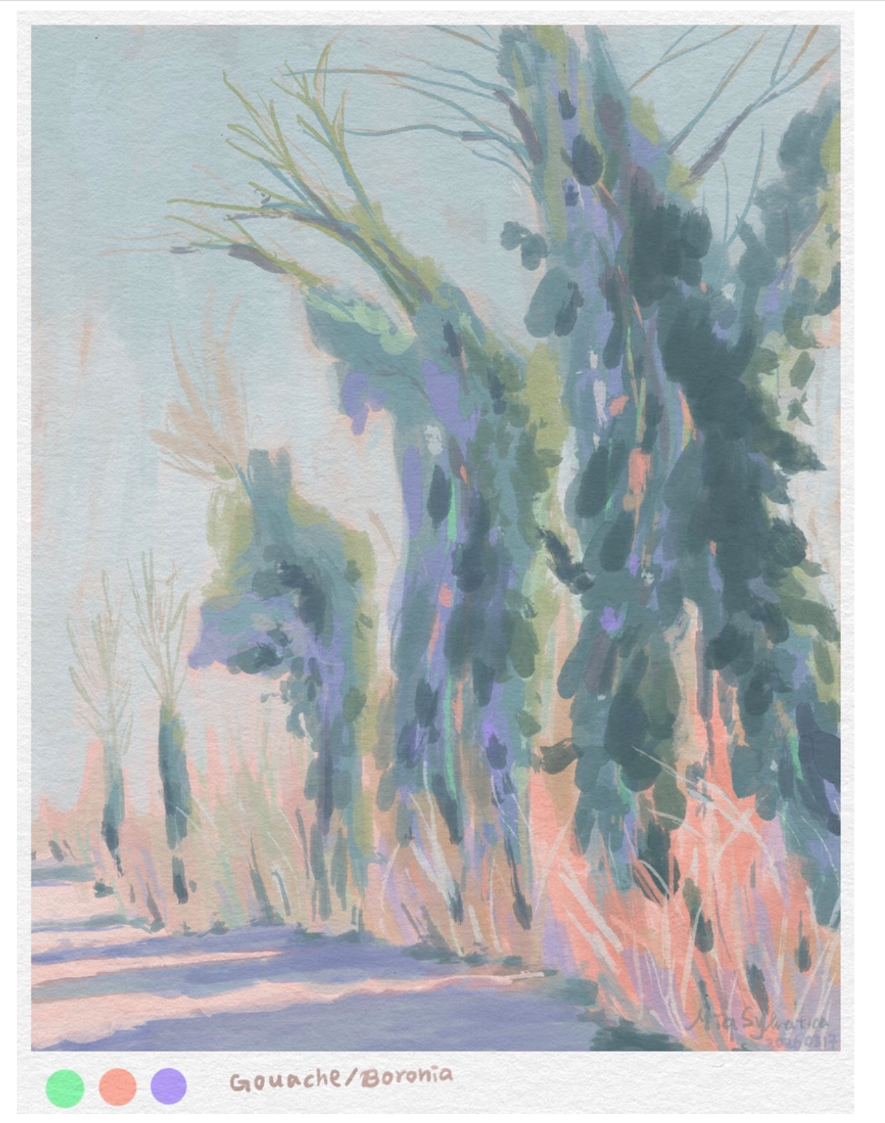
procreate

procreate
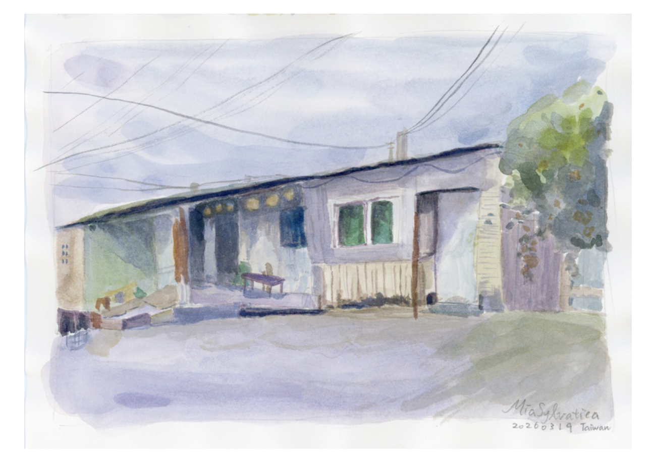
watercolor
Nigel Sutcliffe uses acrylic gouache, so if you’re using mediums that behave differently—like Procreate or watercolor—you’ll need to adapt your approach a bit.
Next, I’m going to share some common challenges and solutions I’ve encountered while mixing colors in Procreate and watercolor, as well as how to choose a base palette. 👇
In short, whether you’re working with a monochromatic, two-tone, or three-color palette, the two most critical factors are value(light and dark) and temperature (warm and cool).
Value can also serve as a key compositional element, allowing you to direct the viewer’s focus exactly where you want it. For instance, areas with strong value contrast naturally draw the eye. This is why many artists begin by creating a value study (or thumbnail) to analyze their subject or plan their composition.
Try practicing by simplifying values—for example, using only three or four levels of brightness. Look at the objects in front of you: How light should this be? How dark? Compared to the object next to it, is it cooler or warmer?
Once you’ve pre-determined these four elements—light, dark, warm, and cool—and decided which colors correspond to them, the actual painting process becomes much easier. Now, whenever I’m out and have a spare moment, I practice observing the world this way. For a more detailed breakdown, I highly recommend Nigel Sutcliffe’s courses or searching for related content on YouTube. Or, you can always ask me! ☺️
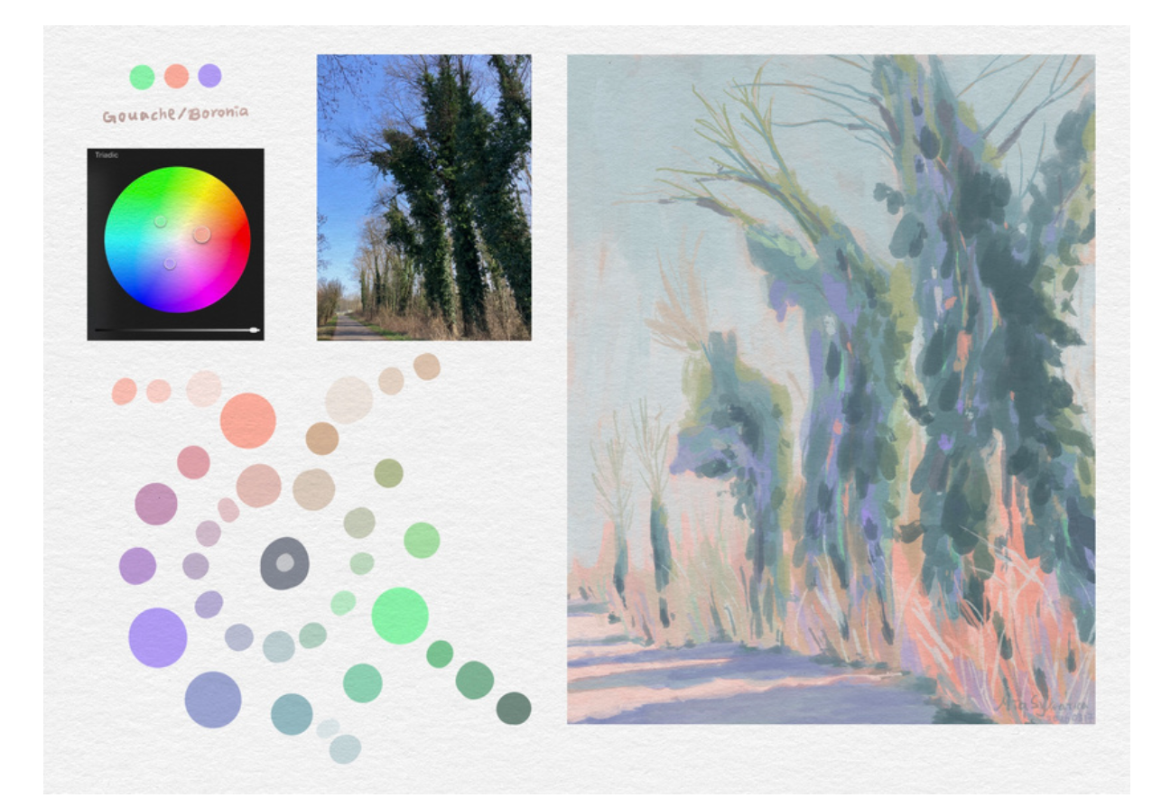
I started by setting the values to a High Key*, opting for salmon pink first to ensure a warm feel; it serves as the underpainting for the entire painting. Procreate has a ‘Triadic’ color harmony feature, which suggested two other colors that harmonize perfectly with the salmon. I’m treating these three as my primary colors—traditionally, these are red, yellow, and blue, but you can redefine them yourself! Since these primaries are very saturated and bright, I mostly use secondary colors for the bulk of the painting, saving the primaries for highlights and accents.
Mixing secondary colors with traditional mediums is straightforward—you just blend two colors in different proportions. But in digital art, where you have to pick every color manually, it’s hard to know what the mixture will actually look like if you’ve never seen it before. To solve this, I use layer opacity to simulate the results. For example, with salmon as my base, I’ll add a green layer on top and adjust its opacity to 25%, 50%, and 75%. This mimics the effect of adding different amounts of green pigment to the salmon base.
By overlaying white at different opacities, you can find the tints (lighter versions) for each color. For the shadows, I mix my three primary colors to create a deep, dark tone, then overlay that dark shade onto the three colors and adjust the transparency. I recommend using brushes with built-in transparency—for example, the ‘Wet Glaze’ brush from the classic ‘Painting’ set, or the ‘Ringaroona’ brush from the ‘Basics’ set while manually adjusting the opacity of three different layers.
Keep in mind that this dark tone will lean toward whatever color is on top. For instance, if you layer purple over salmon and then add green on the very top, you’ll end up with a greenish dark. As the artist, you have total control over the color bias of your darks—especially since your three primaries aren’t restricted to traditional real-world colors anyway.
Here’s how I recommend choosing your colors:
- Go for a bluish tone (since shadows on a clear day are typically a cool blue or purple).
- Observe the actual shadow in front of you—is it leaning cool or warm? Match that to the temperature of your three chosen colors to decide which one should be the top layer.
If these three colors aren’t dark enough, simply go to your color palette and nudge the value darker and the saturation lower until you get that perfect, deep shade.
Before you even touch the canvas, define the warm and cool ranges for your three colors (decide exactly where ‘warm’ ends and ‘cool’ begins on the color wheel). As you paint, constantly ask yourself: ‘Is this relatively cool or relatively warm? How light or dark is it?’ Then, simply pick your color from the range you’ve already mapped out.
*For more details on High Key, Middle Key, and Low Key, you can check out this video: How To Paint Like A Pro – Keys To Successful Painting.
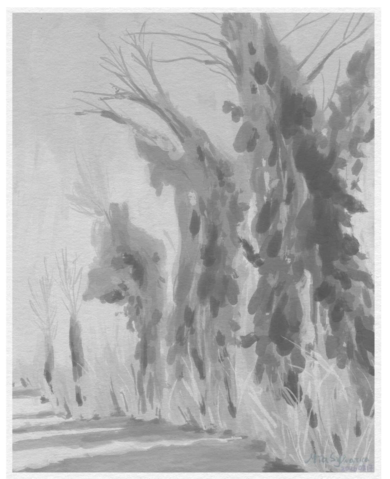
I always double-check the values in my work. Sometimes, converting a reference photo to grayscale is a great way to observe the lights and darks more clearly.
Once you have these basics down, you can take it a step further. Start exploring and experimenting with different color schemes—whether it’s from a painting you admire or the natural palette of a scene right in front of you.
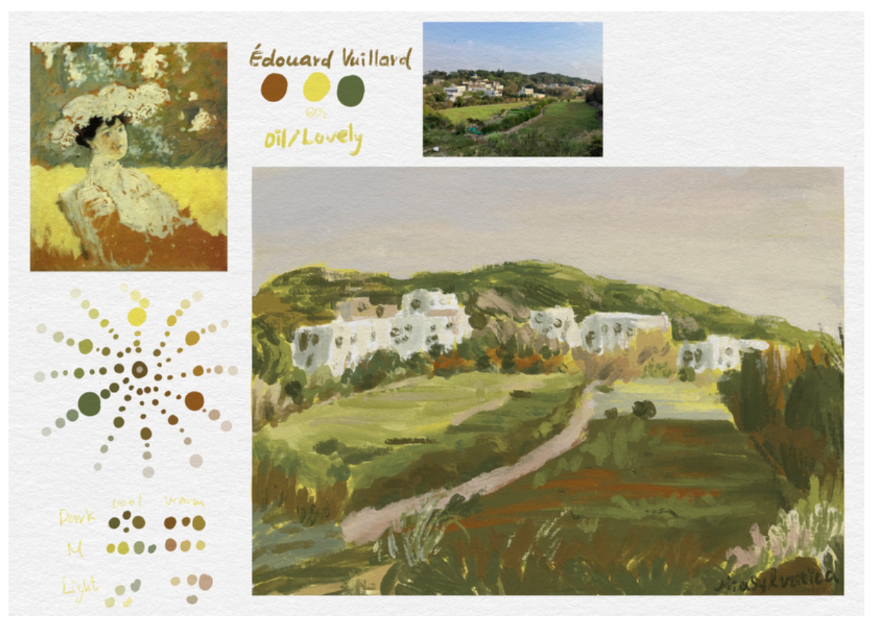
I’ve selected three colors from this painting. If you want to create a High Key look, you can choose brighter, more saturated colors.
Following the same process as the first piece, I planned out my colors and started painting. Seeing the final effect of the chosen palette was honestly so much fun! It’s this sense of magic that makes me want to keep painting and exploring different color combinations forever.
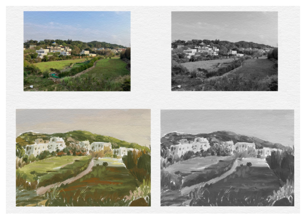
Watercolor
Whenever I’m feeling uninspired or stuck on a color palette, I like to just draw colored pencils at random. It’s a great way to pick a palette quickly before heading out—you can check out this post for my quick color selection method!
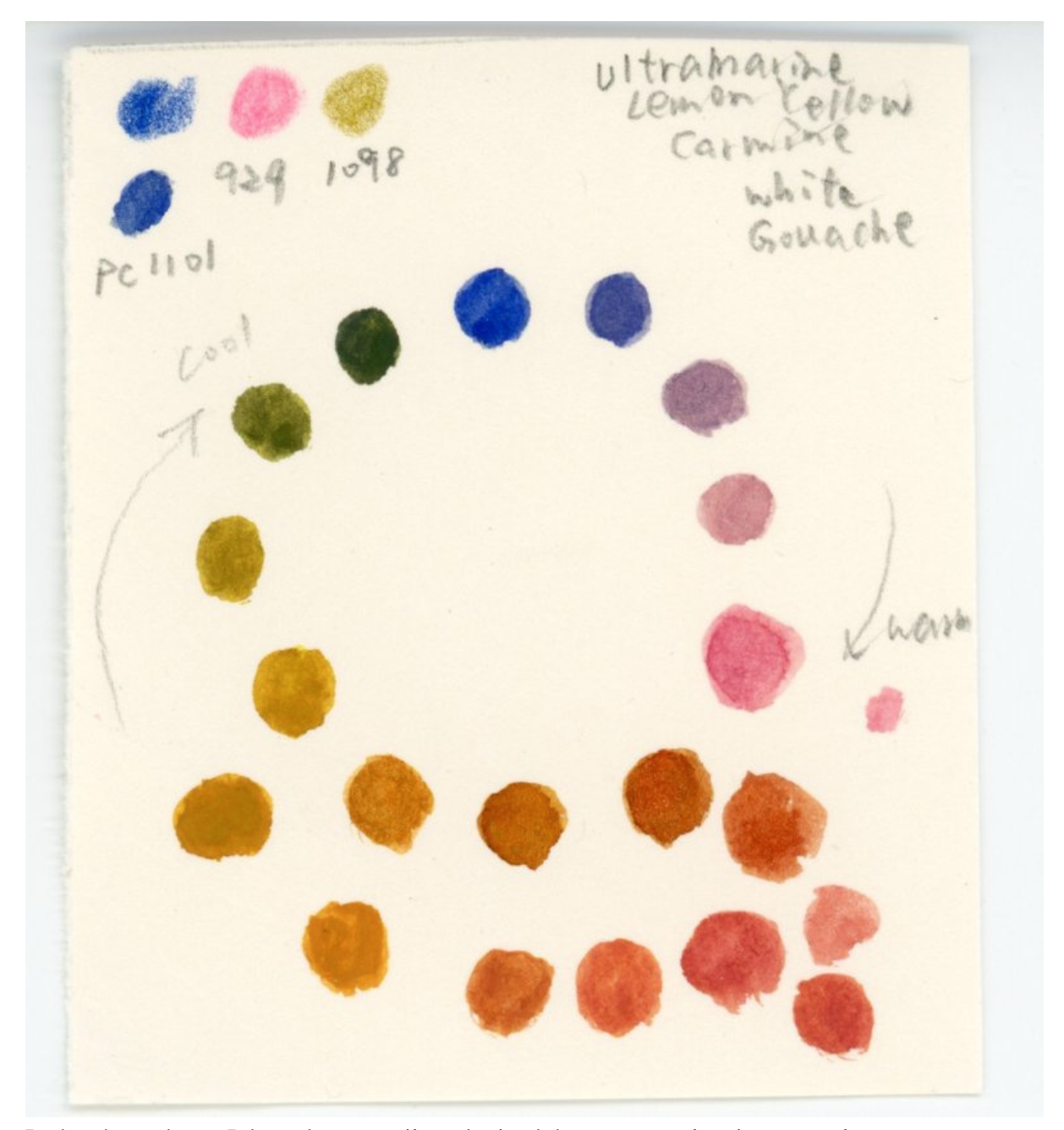
In the photo above, I drew three pencils and mixed those exact colors in watercolor to serve as my primaries. Think of them as a ‘biased’ version of the traditional Red-Yellow-Blue triad. For the pink, I actually forgot to add white the first time, so I had to remix it!
The tricky part about mixing your own colors is that you have to start from the primaries every single time—or mix a large batch at once (though the paint might dry out). Honestly, if you have the budget, buying the specific tubes of paint is much more convenient, and the colors stay a lot more saturated!
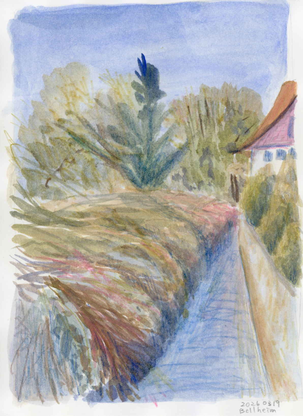
My first attempt wasn’t very successful; I think I just wasn’t used to the process yet. Maybe I let my laziness get the best of me by skipping the step of properly mixing a full range of values, or perhaps the colors just ended up looking muddy. It also felt a bit ‘off’—since I had to remix the colors every time, I felt like I was losing my accuracy and didn’t have a solid foundation to lean on.
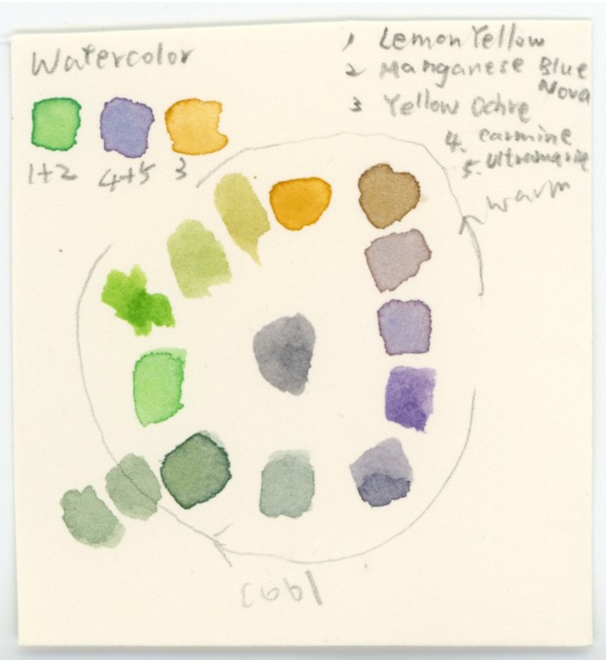
By the second attempt, I was getting used to the remixing process. I didn’t even need to pre-mix the new primary colors anymore; I just had to know which color needed a higher proportion in the blend. (Luckily, one of the colors was a ready-made one, so no mixing required! 😂) I intentionally chose brighter primaries this time because I wanted to avoid the painting looking too dull or muddy.
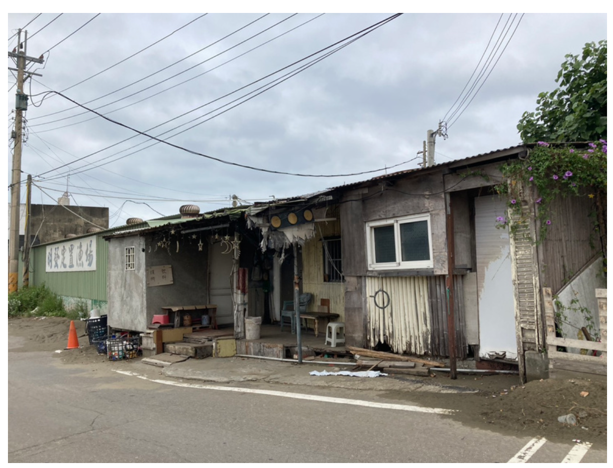
From the photo, I identified green, purple, and yellow. I’ve always wanted to capture a cool, serene atmospherepunctuated by subtle warm accents—it creates such a peaceful, laid-back vibe. Even in the heat of summer, painting with cooler tones makes everything feel refreshing and light. To achieve this, I mixed my greens and purples using cool pigments, leaving Yellow Ochre as my only warm element. It fit my plan perfectly. Ultimately, choosing colors is about the ‘feeling’ of the subject, or the specific emotion you want to convey.
In watercolor, lighter values are achieved by adding more water. On professional-grade paper, this often results in a clean, transparent look, though it can sometimes feel a bit thin or uninspiring. However, thanks to the specific texture of this paper, it took on a romantic quality—almost like wet gouache. For the darks, I mixed complementary colors or added a deep blue. By blending all three colors from my triad, I created a near-black gray that feels rich because it contains those opposing hues.
I kept asking myself: ‘Is this warm or cool? How dark or light should it be?’ I think the final piece is absolutely stunning! (I hope it’s not just because I’m biased toward purple, haha—I love purple! 😆) I really want to turn this into a postcard.
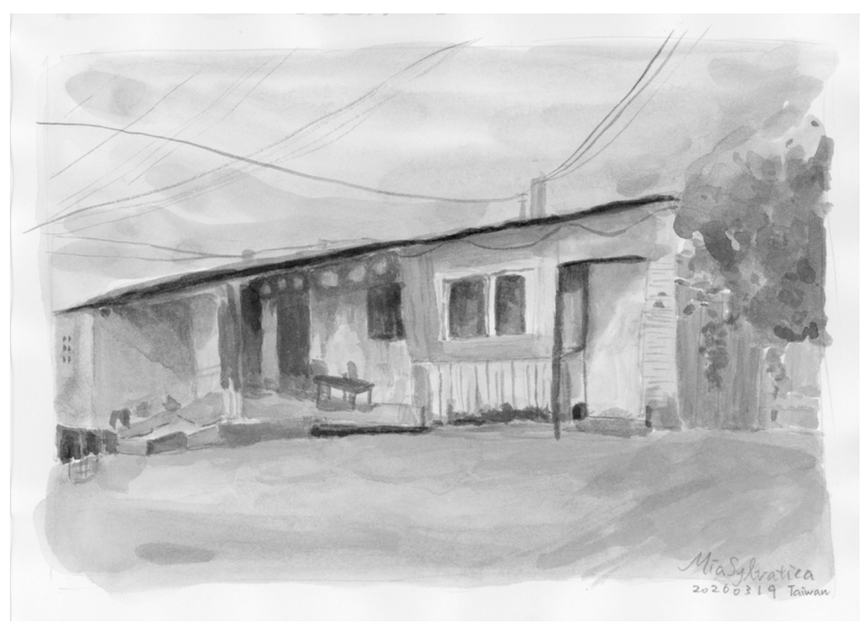
I hope I didn’t get too carried away with the technical side—feel free to let me know if it’s a bit much! 🙂
Mia
—
For landscape painting, I’d also like to recommend Jowita’s course:
Sketchbook Series: Painting a landscape in gouache