Color Selection Techniques for Outdoor Sketching and Creative Work
I’ve always admired people who go out sketching. Not only do they have to overcome the inconveniences of the environment, but also the gazes of pedestrians. That’s why I seldom do sketching outdoors. But this year, I really wanted to get used to it. So I started doing it occasionally, and to my surprise, by the third attempt, I began to adapt.
In the past, before going out to sketch, I would always spend ages thinking about which colors to bring. But after that overthinking, I’d realize that it was hard to make them work together while drawing. Later I discovered a useful color selection trick. After trying it, I found it really works! Suddenly my brain felt so much lighter. XD
The Trick: choosing colors based on light and dark values. If the composition of light and dark plays such an important role in how a drawing looks, then maybe selecting colors by their values would naturally produce good combinations, right?
Take colored pencils, for example. How do you usually sort yours? By color group? That’s how I did it at first. Later, wanting to reduce the number of containers, I grouped complementary colors together. Now, I organize them by value and saturation, using three containers: light/bright, saturated, and dark/heavy. With this system, picking colors is as simple as grabbing one pencil from each container—whether randomly or intentionally—and the combinations work out nicely! Different media can be also mixed in the same container. (Be careful with dual-tip markers/brush pens—storing them upright can sometimes cause one tip to dry out. I only do this because I don’t usually use the finer tip.)
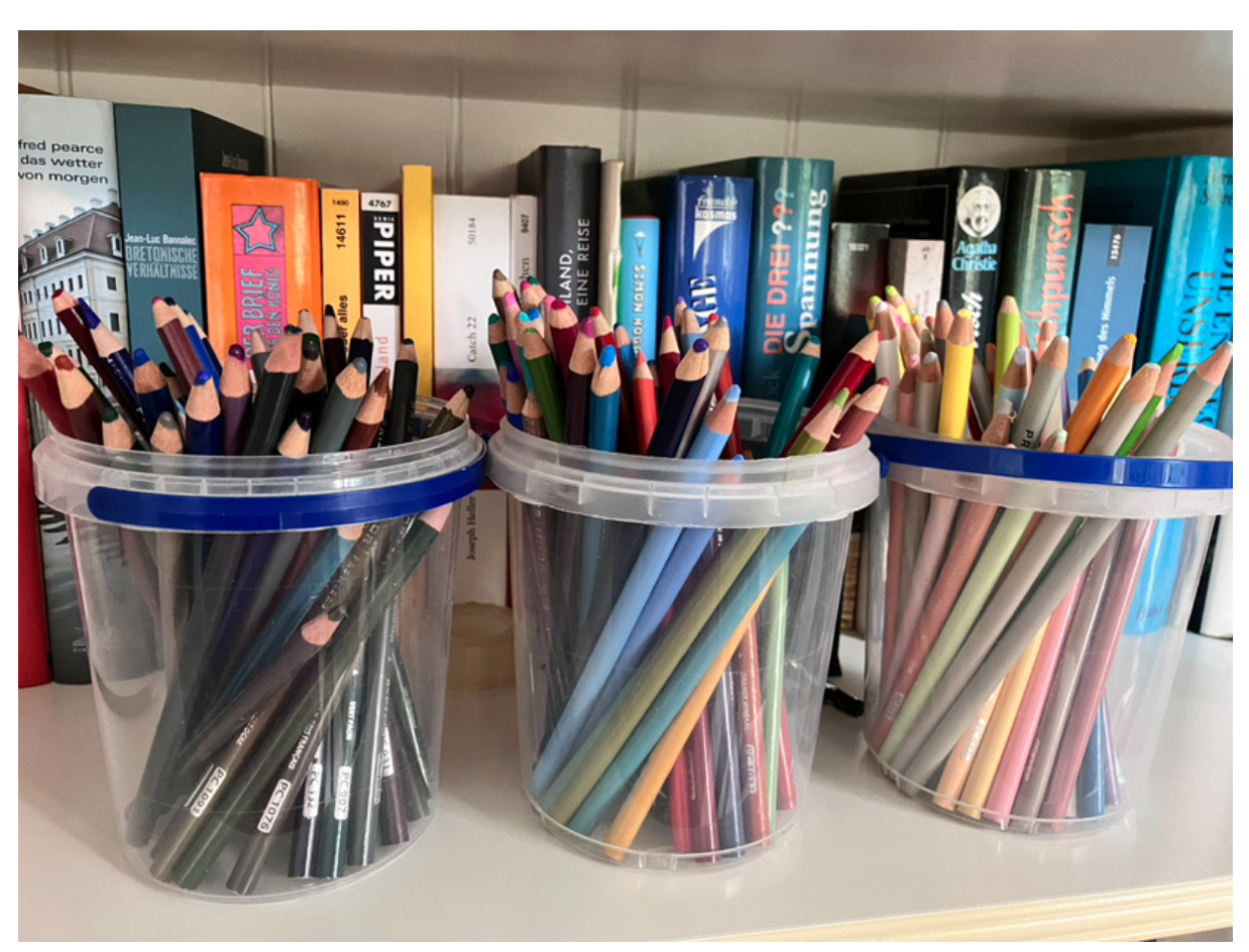
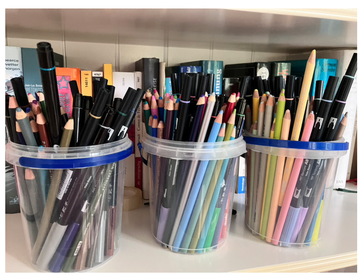
If you’re selecting colors more consciously, I suggest going back to what you want to express. Decide what you want to express first, then pick one pencil from each container accordingly. While traveling, you can choose colors based on the season, the atmosphere of the city, or the colors most commonly seen there. If one pencil from each container isn’t enough, you can take two from each. For a bolder effect, grab more from the saturated container. For a gloomier mood, choose from the dark/heavy one. For a light and airy feel, select more from the light/bright container.
When creating with media that aren’t single-stick tools—like watercolor or gouache—I think the same method still applies. You can first select colors conceptually from the three categories, then mix the paints to match. This color selection trick can also help by limiting your color palette.
The funny thing is, looking back, I wonder why I kept choosing crowded places XD. No wonder it was always so hard to gather the courage to pull out my pen and sketchbook again. The first time was in a forest. I thought there wouldn’t be many people, but suddenly a mother and child came by. They said, “What a great idea! Next time we’ll bring art supplies and draw in the forest too.” Then the mom picked up her child and just stared at me drawing. The pressure was overwhelming—I felt frozen, unable to move or draw because of the pressure and thinking, “Please just leave.”
The second time, I chose a riverside where people constantly came and went. A child came so close they almost touched me, staring intently at my drawing, which was also an uncomfortable experience. The third time, surprisingly, I sat at a street corner. Though it looked like a dangerous spot, it was actually the safest, since everyone was looking straight ahead as they passed by and ignored the person sitting near the entrance. That time, I finally managed to focus fully on sketching, so I didn’t even notice who was watching!
—
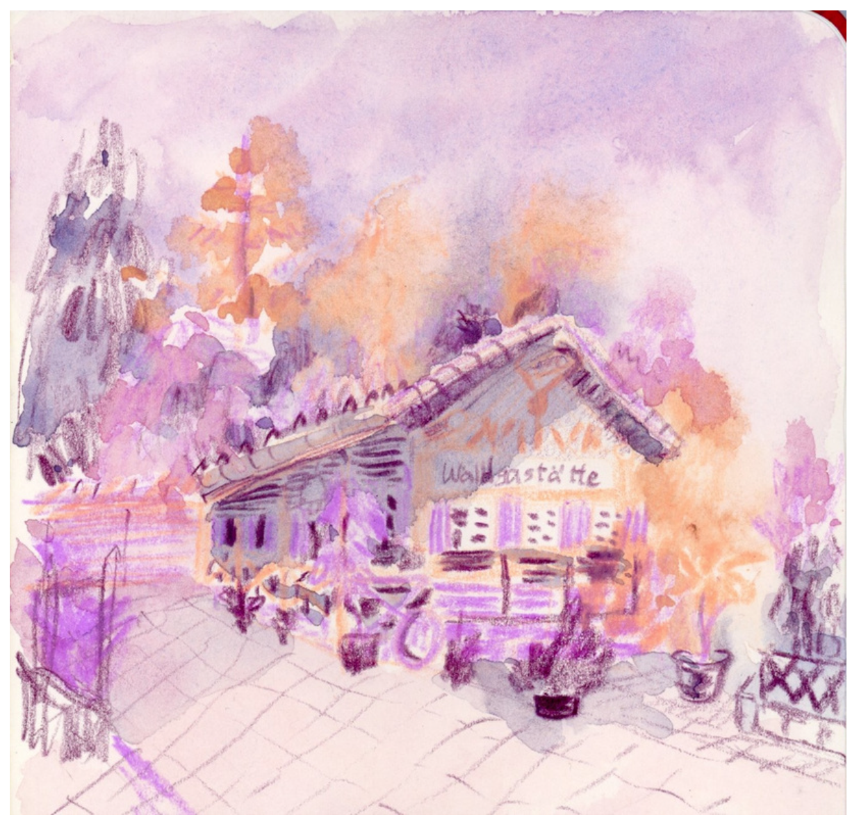
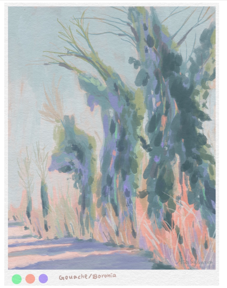
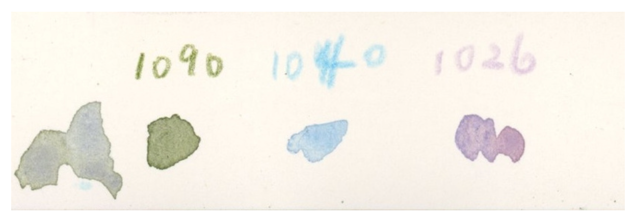
I chose the three colors intentionally before I went out. My concept is to capture the arrival of autumn, with nature’s colors shifting as if by magic.
Mia