How the Skagen painters reshaped my sense of color
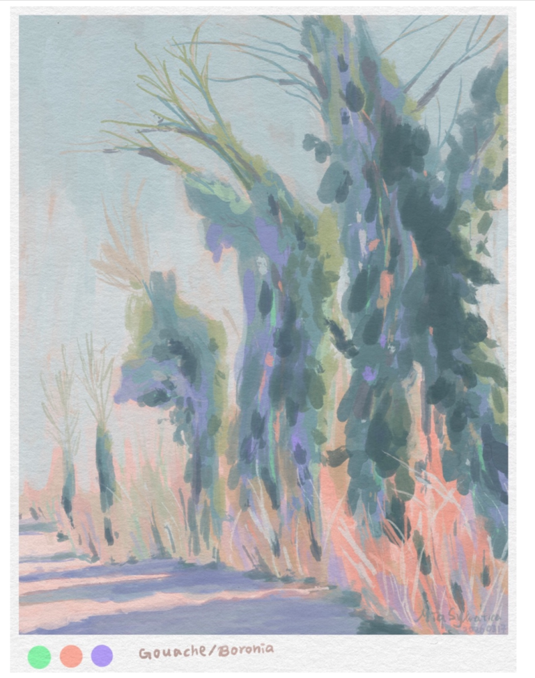
Since I painted the fritillaria-patterned canelé last time, I’ve felt dissatisfied with the colors, which made me want to relearn color and find a style of color expression that I truly like. Looking back at my watercolor paintings, I was often afraid of using colors that were too vibrant. That inner hesitation backfired—my mixed colors turned out muddier, or rather, overly heavy, without a sense of airiness. Just as I was struggling to search my mind for answers, an image from the Skagen painters suddenly appeared before me. Perhaps because I’ve been going through some emotional turbulence lately, I found a sense of inner calm in the works of the Skagen artists, and that led me to begin exploring what the Skagen Painters really is.
Skagen is a small town at the northernmost tip of Denmark. In the 19th century, Danish painters influenced by Impressionism and Naturalism gathered in this town, and they became known as the Skagen Painters. Their most common subjects were fishermen, everyday life, and moonlit evening scenes. Among them, I personally prefer the works of Peder Severin Krøyer, Marie Krøyer, Anna Ancher, and Laurits Tuxen. Peder Severin Krøyer’s night scenes are especially worth savoring—whether indoors or outdoors, he portrays the light within the darkness of night with such romance that, as you admire his work, you can quietly feel emotions flowing gently through your heart.
I’m not sure if it’s because of Skagen’s northern location or the simplicity of its local scenery, but compared with the French Impressionists, the colors in their paintings feel less noisy and not as intensely saturated. When you look at them, there’s a quiet, serene feeling that settles in the heart.
Next, I’d like to share some reflections from my process of studying these paintings. I was even afraid I might forget the techniques, so I recorded some painting videos along the way.
I chose to do copying studies as a way to correct the watercolor habits I’ve been trying to break. This time, I think the practice was so rewarding because the works I studied were very different from my own—almost like moving in an entirely different direction. I had studied French Impressionists before, but the experience was never this profound.
In addition, working with a different medium created a new kind of spark. When studying with watercolor, I had to translate the oil-painting techniques into watercolor techniques. For example: how do you express oil-painting smudges, layered colors, and value using watercolor? These were questions that came up throughout the process, and also what made the exercise so interesting—especially because the difference between the mediums is so great.
Before painting, I set a learning goal: just study the colors. Don’t worry about composition or proportions for now, and start painting directly without draft. Working this way gave me a great sense of freedom, and it made the whole experience feel much more relaxed!
Michael Ancher, Laurits Tuxen
Seaside life on Skagen beach in the midday sun
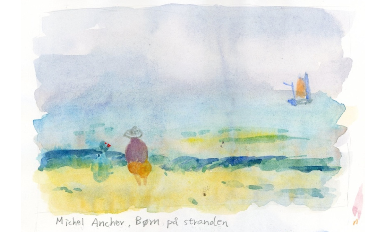
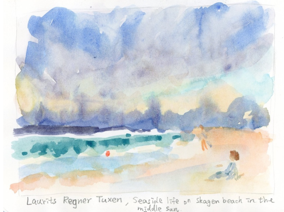
I’ve always been afraid to use bright, vivid colors, yet during this practice I ended up using them boldly. I think it must be because I trusted the judgment of the painters I was studying! It really shows how much your mindset influences your work… When creating, I should trust myself a little more. Later, when I compared the results, I realized that although my goal was to copy the colors, I had actually been copying the light and shadow instead. The yellow in the top image is cooler than in the original painting, and I even used lemon yellow—a color I’d rarely dared to use before—but surprisingly it didn’t feel out of place.
Here’s how I interpreted translating oil-painting values into watercolor: the “light” areas use more water to dilute the paint, and the “dark” areas use more pigment. Low-saturation colors are also achieved simply by adding more water.
I love these two pieces so much after finishing them! They feel so light and airy. I really want to paint works like those of the Skagen painters, give people a sense of calm and ease. Even when depicting sorrow, I want it to have that tender, quiet kind of sadness that barely shows.
Peder Severin Krøyer
Study of the sky. Sunset over Skagen
Landscape of Stenbjerg under the Moon
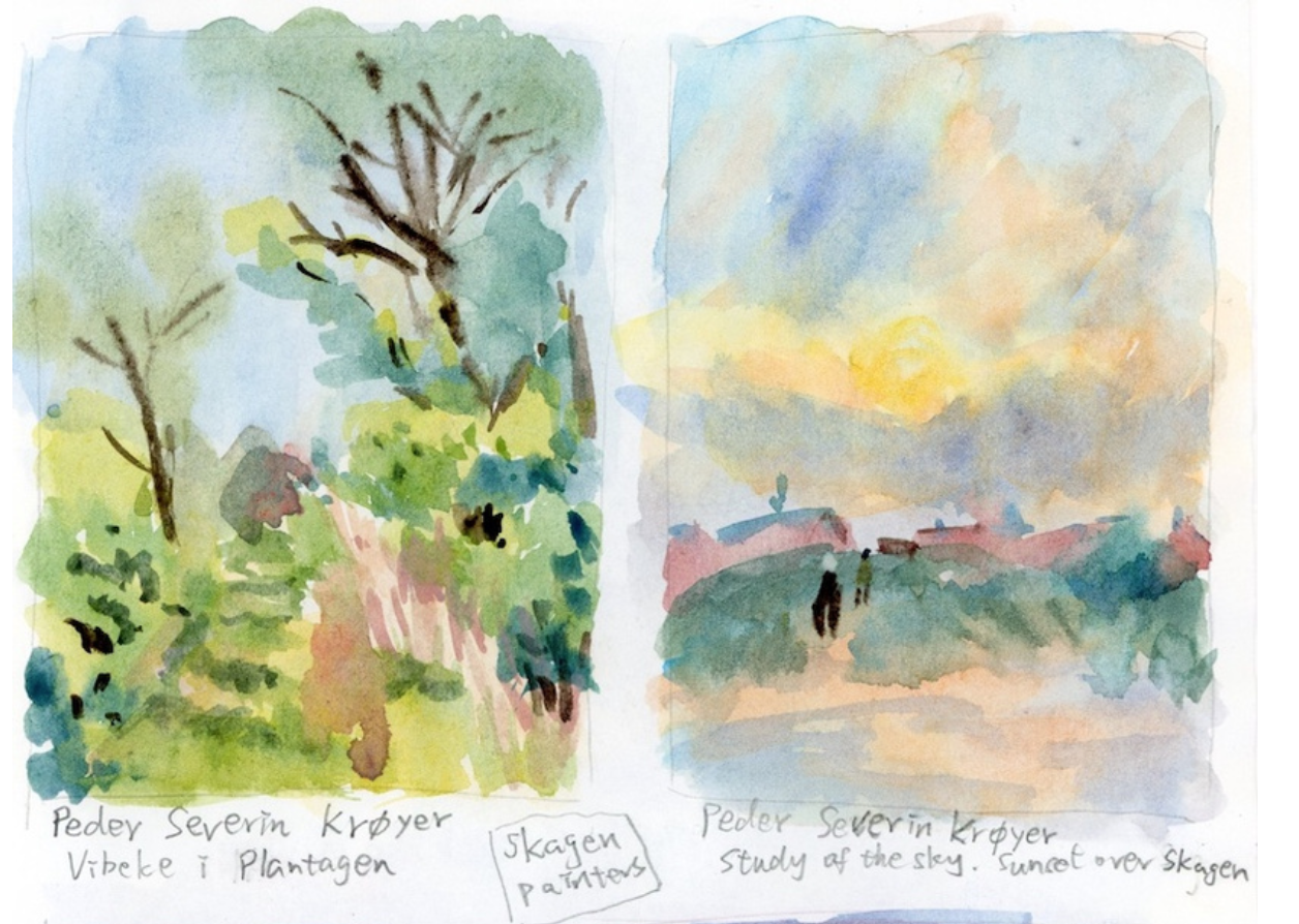
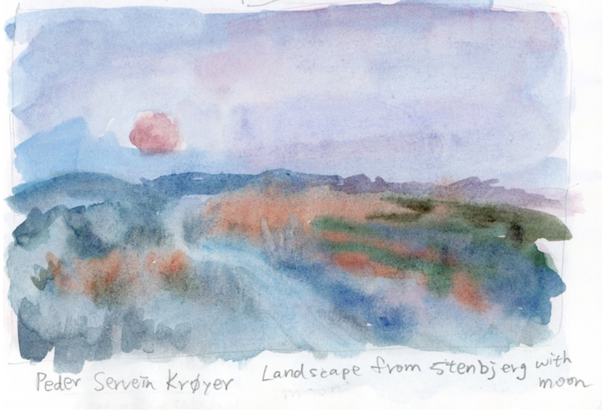
Tricky greens have always been my weakness! In the top-left piece, thanks to P.S. Krøyer, I finally experienced how to paint greens that are bright and rich without turning into weird, “cursed” greens. 😂 I think the key is adding some yellow—specifically cool yellow—to make the green work. Compared with warm yellows, I definitely prefer cool ones. I remember noticing in spring, too, that the presence of cool yellow made the whole environment look harmonious and beautiful.
The top-right piece felt like a lesson on how to combine complementary colors well—for example, blue and orange, or red and green. Red and green especially tend to go wrong easily. 😆 I’m not sure if it works here because both the red and green lean cool, or because of the value differences, or maybe because they both sit on top of a faint wash of orange underneath, which helps them blend harmoniously. 🤔
Many artists paint night scenes to be very dark, but P.S. Krøyer’s nights always have a bright moonlight—never pitch black, but a comfortable blue tone with a beautiful atmosphere. The challenge in Landscape of Stenbjerg under the Moonwas working with low-saturation colors and many hues blending together. I was afraid they’d turn muddy or too dark. For this one, I used the wet-on-wet method, dropping in pigments and trying not to intervene too much with the brush—just a light tap or a single stroke—letting the colors flow and diffuse on their own. If the brush goes back and forth too much, the colors mix into gray! Waiting until the paper is half-dry or fully dry can also create distinct, separated color effects.
Marie Krøyer
Solbeskinnet pergola fra Ravello
“P.S. Krøyers Hus pà Skagen”, eller Madam Bendsens Gård
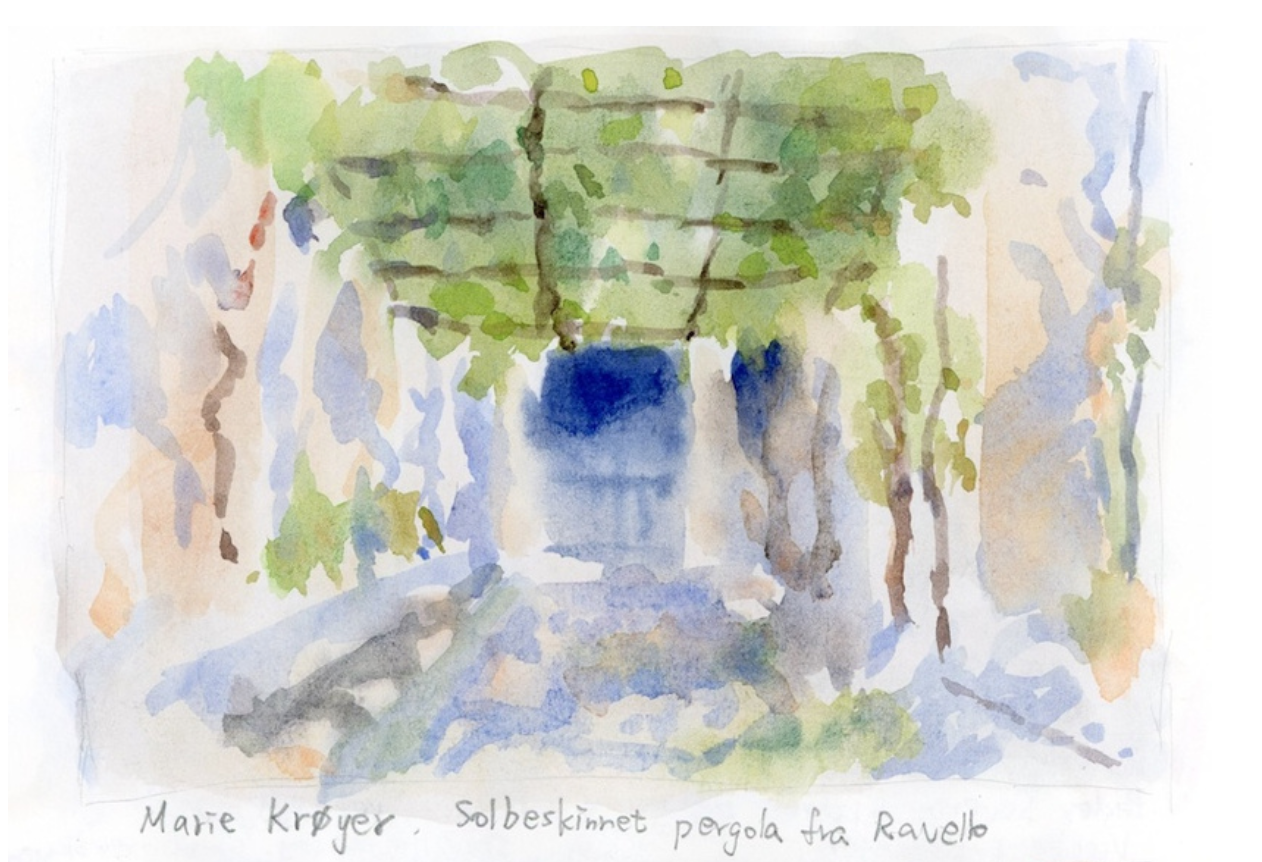
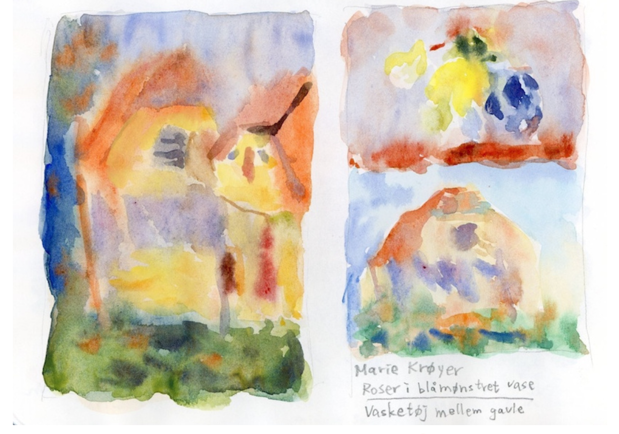
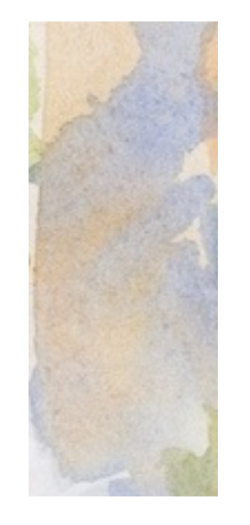
I absolutely love Marie Krøyer’s Solbeskinnet pergola fra Ravello! 😍 The light and shadow are incredible—there are even those little white spots of glowing light shining through. To keep the blue and orange from turning muddy, I painted in two layers: first the areas with the warm orange light, and after that dried, I added a light wash of blue shadow on top. That way, the orange glow underneath shows through. As in the image below, I’m really happy with the texture this creates!
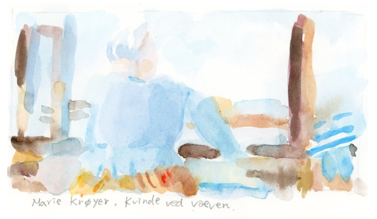
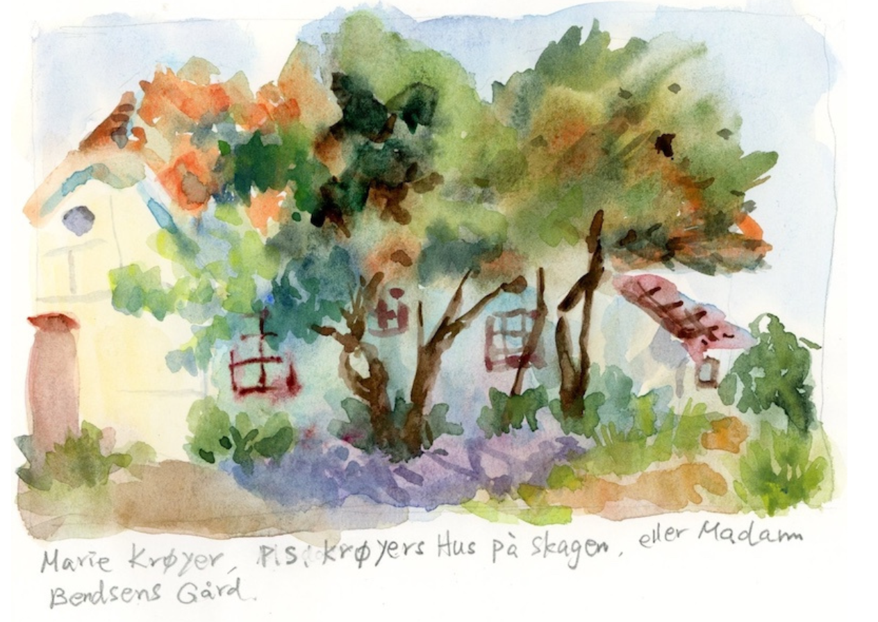
As I kept painting, the colors somehow ended up getting heavy again. 😂 This is my bad habit—I love adding more and more details, and if I don’t, I start feeling uneasy. But sometimes, it really is time to stop!
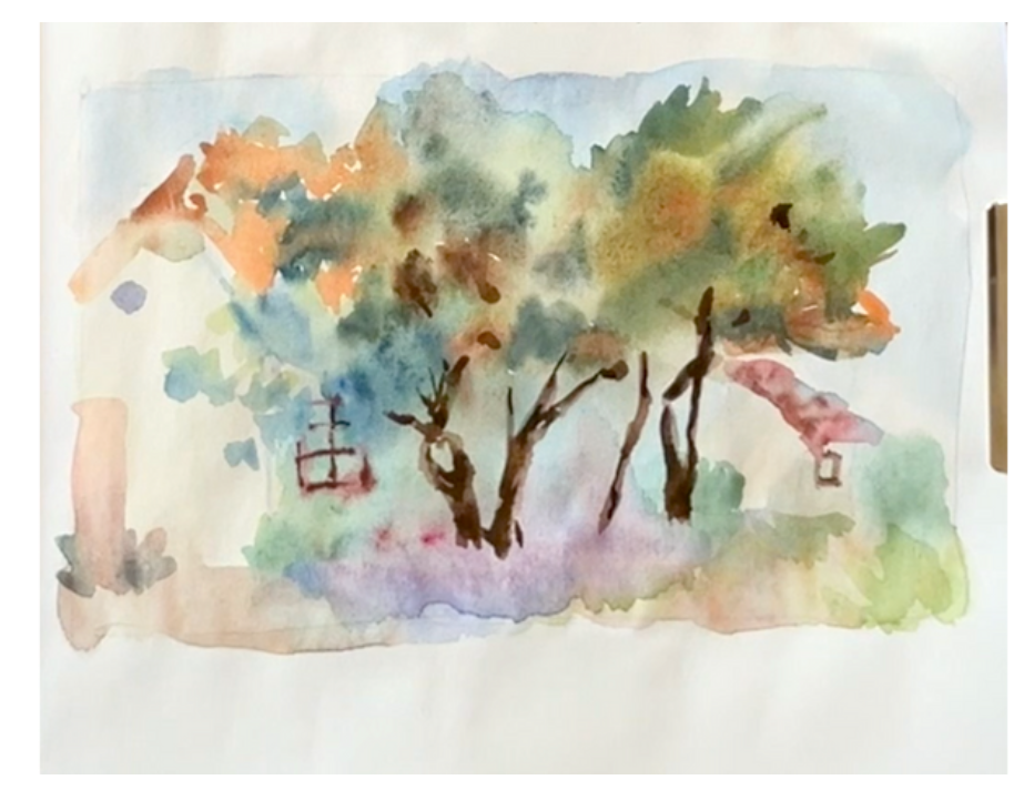
Watching the recording of my painting process, I started thinking that maybe the values should have stayed at that stage instead?!
Later on, I wanted to apply what I had learned from the studies to an illustration I’d been wanting to draw. But of course, things weren’t that simple! I ended up painting it twice, and in the end, I still wanted to swap the mountain from the second version with the mountain from the first.
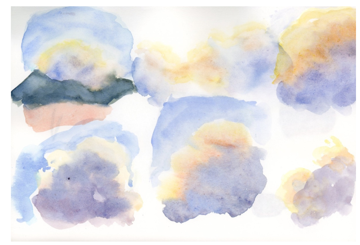
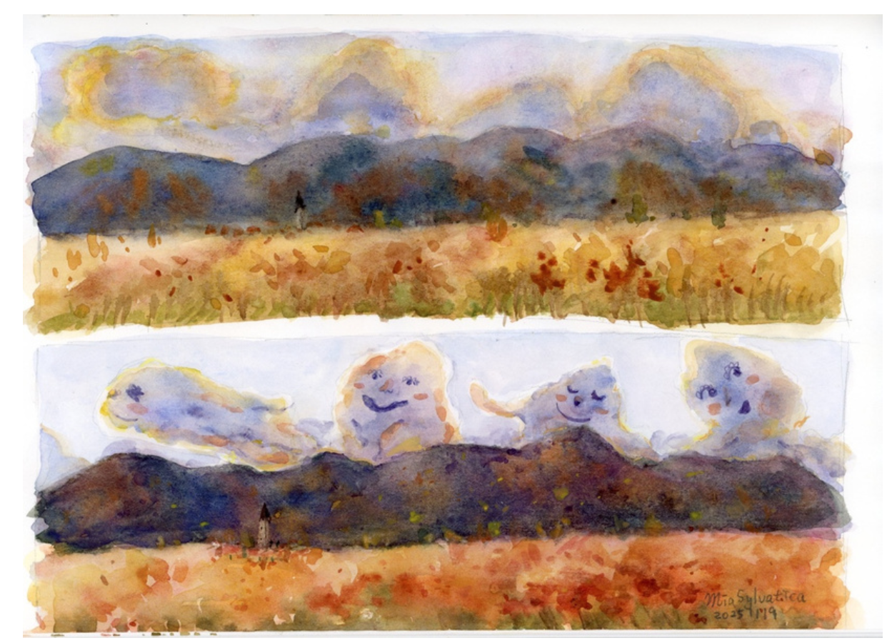
A parade of clouds. That day, the sun was rushing to set, and I saw the clouds moving so fast—cumulus after cumulus in all sorts of shapes drifting behind the mountains, like a marching parade.
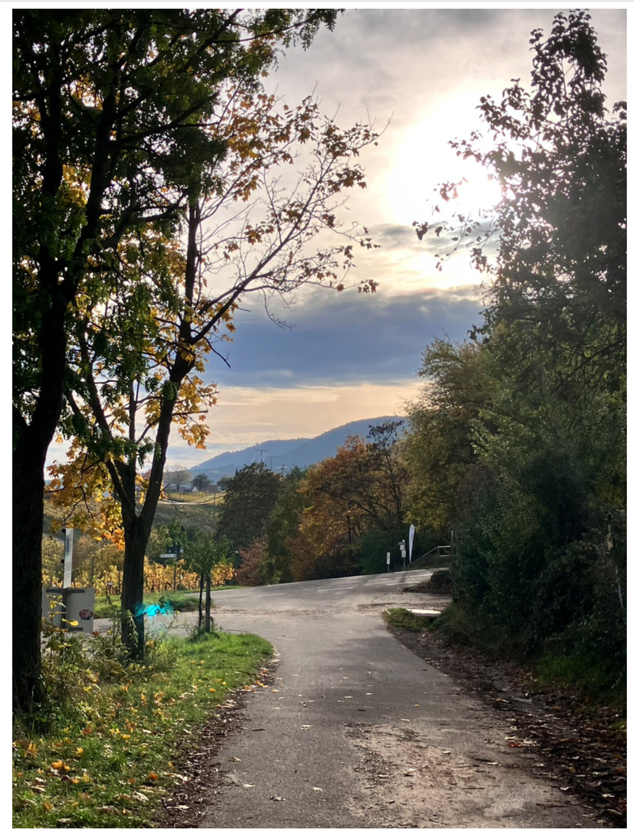
I also tried painting from photos I took while on a walk. I really enjoyed painting the two pieces below! In my previous works, it was always difficult to capture a sense of light.
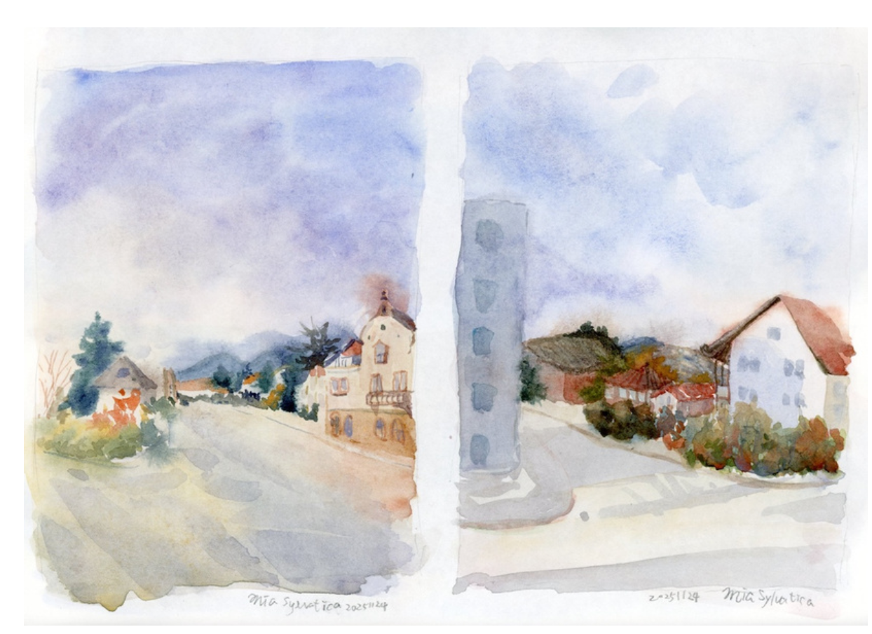
After just one day, I gradually slipped back into my old habits. The colors became heavy again—Oh no~~! As expected, habits aren’t easy to break (I’ve heard it takes 21 days). So I’m planning to practice in cycles—one session learning from a Skagen piece, and the next applying it to my own work.
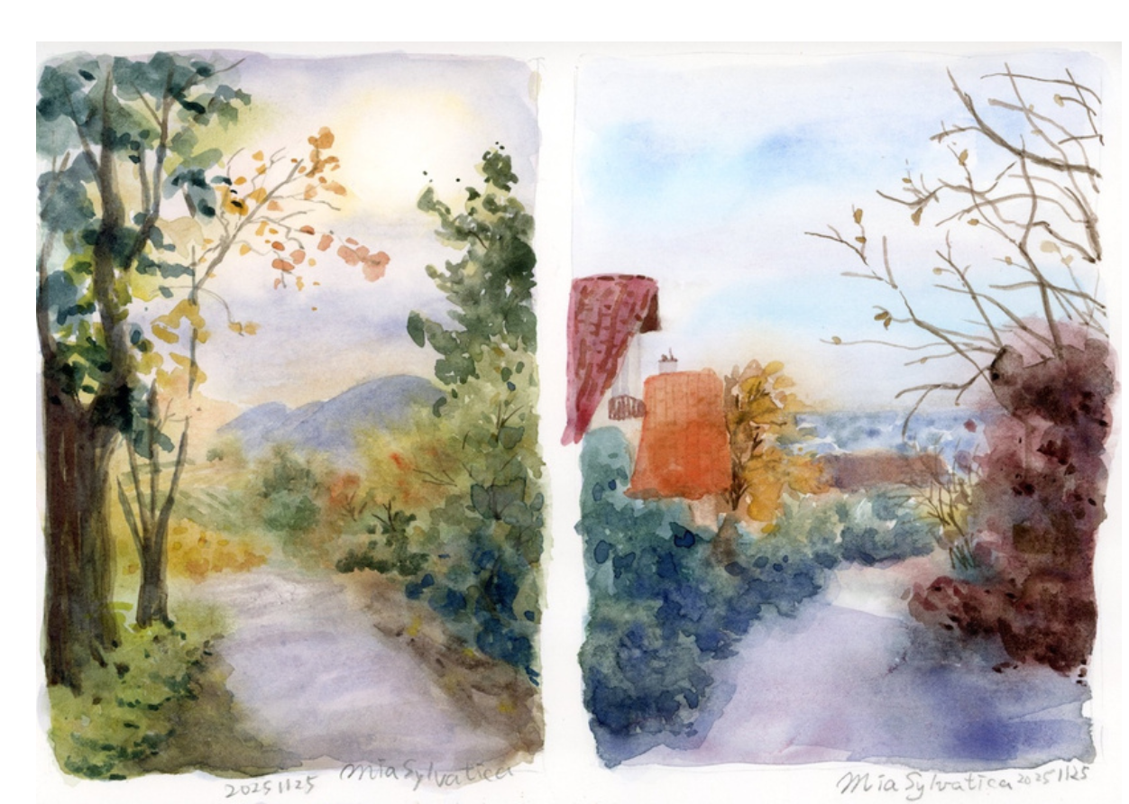
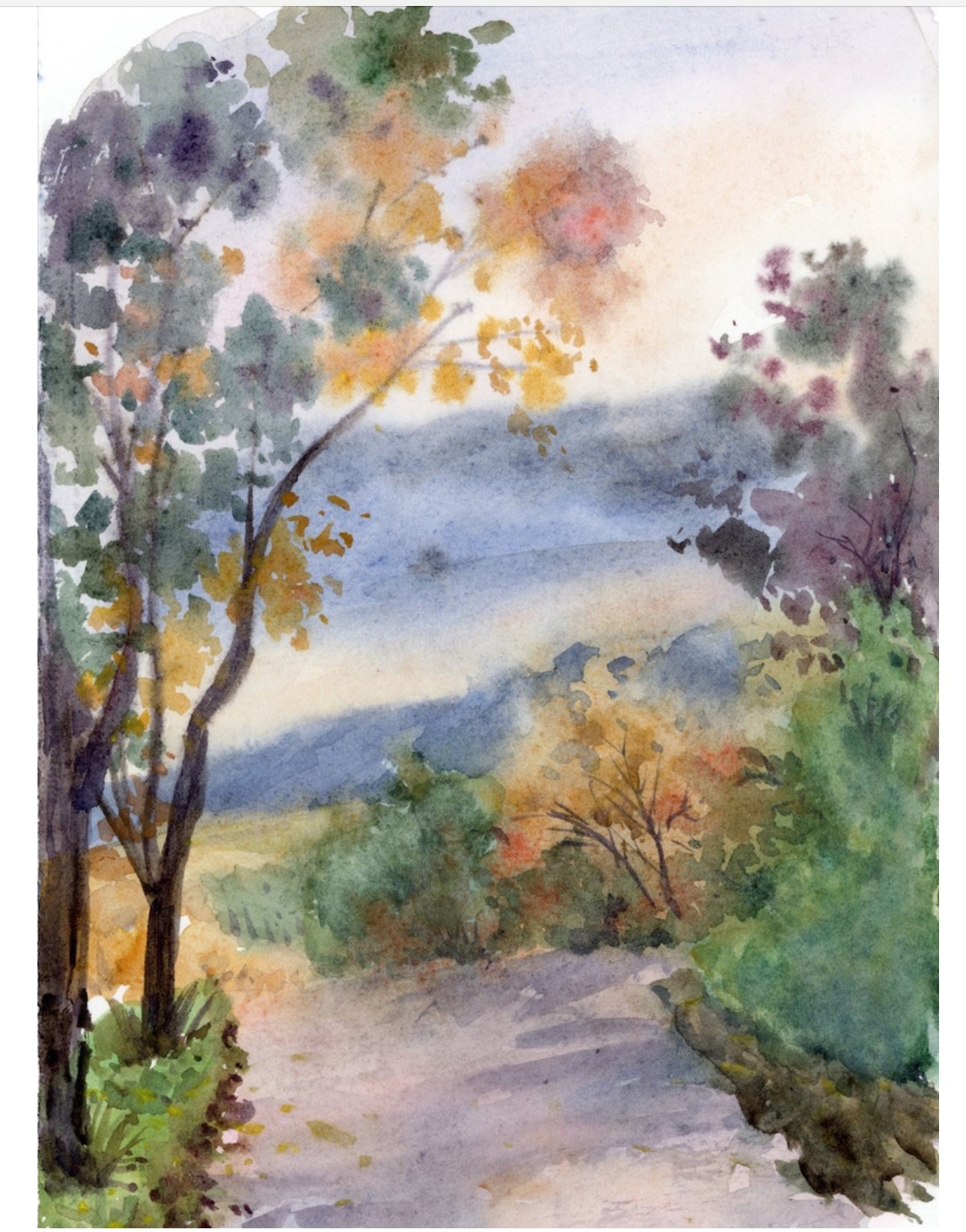
But compared with the piece below, which was painted from the same photo reference, I can see there’s still a lot of progress…
Maybe it’s because of the perspective class I took a few days ago—this time I finally managed to get the aerial perspective right!
Sometimes, because of my introverted personality, I feel too shy to ask questions to teachers from past classes. Even when I do ask during class, it’s hard for teachers to fully understand a student’s actual circumstances, so the most they can say is “keep practicing.” But all those devilish little questions hidden in the details—surprisingly, many of them were answered through copying studies.
If you decided to study by copying to solve your current art problems, which painting would you go for?
If you enjoy articles that dive more deeply into a single topic like this one, let me know what you think!
Mia
About Peder Severin Krøyer & Marie Krøyer…
The two met and fell in love while studying art in Paris, and shortly afterward they married—everyone admired them as a perfect couple. Unfortunately, P.S. Krøyer’s mental illness made it difficult for their marriage to continue. Later, Marie Krøyer separated from P.S. Krøyer and fell in love with another Swedish musician. It took a while before she remarried, but that marriage eventually ended due to her second husband’s infidelity. Marie Krøyer lived the rest of her life on her own.
After getting married, Marie Krøyer painted less. Some say this was because she became depressed after having a child and her mental health suffered. However, researchers at the Skagen Museum believe she didn’t give up on artistic creation—she just painted less, focusing more on textiles, furniture, and interior design.
As for P.S. Krøyer, why is it that such a talented person also suffered so much mentally? Perhaps it’s because people like him are particularly sensitive, able to deeply feel things that others cannot perceive and experience emotions that many would choose to ignore.
There’s also a related film, The Passion of Marie, which tells the life story of Peder Severin Krøyer and Marie Krøyer, focusing on Marie’s struggles as a woman within the societal context of her time.
—
About Skagen Painters
Google Arts & Culture
Skagen Museum
The Hirschsprung Collection
Marie Krøyer|Søren Bie Personal Project
Peder Severin Krøyer og den blå time|Youtube
Peder Severin Kroyer – 106 artworks – painting
Peder Severin Krøyer — Google Arts & Culture
Peder Severin Krøyer | Artists | Art Museums of Skagen
Midsummer Eve bonfire on Skagen’s beach — Google Arts & Culture
(I’m really surprised that P.S. Krøyer actually included Marie and the Swedish musician in his paintings.)
Midsummer Eve Bonfire on Skagen Beach – Wikipedia
Anna Ancher – 58 artworks – painting
Anna Ancher — Google Arts & Culture
—
Music from #Uppbeat (free for Creators!):
https://uppbeat.io/t/jonny-easton/kiss-the-sky
License code: AVXONL7PGYBLUYJA
https://uppbeat.io/t/jeremy-mayfield/tightrope-waltz
License code: R4M9DIR2EU46TP5P
https://uppbeat.io/t/brock-hewitt-stories-in-sound/the-calm
License code: AE3JQOJRXAKTH4AQ