How to choose a color palette for your illustration?
There’s always more to discover when it comes to color. Preferences, experiences, and perspectives change at different stages of life, and they all influence the color choices in illustrations. Choosing the right colors is difficult—I still feel that way and continue to learn.But even in this challenging situation, is there a strategy that could serve as a starting point for color selection? I’m also very curious about how other illustrators approach color choices.
I’ve always loved Deer’s soothing color palette and was eager to learn about her approach to color selection. So, I joined her online watercolor course on Yotta: Illustrating Everyday Scenes | A Hand-Painted Guide to Creating a Cozy World. At first, I felt that the course didn’t dive deeply into color theory. Even after watching it the first time, I still wasn’t sure how to choose colors. But I decided to follow Deer’s process and paint those storefronts anyway. Based on my past experiences, even things that seem simple at first always bring valuable insights once I start painting. As time passed slowly, I immersed myself in the details, quietly observing and discovering the subtle shifts and transformations in the artwork. Before I started painting, I rewatched the section on color selection. That’s when I realized that Deer wasn’t providing rigid theories but rather a broad direction—a core concept: maintaining color balance.
“Maintaining color balance” may seem like a simple phrase, but when you think about it carefully, it actually involves countless difficult decisions. Every choice an artist makes during the creative process is a blend of rationality and intuition, influencing the elements of a painting. It’s similar to learning how to steer a car—when faced with the road ahead, if you need to turn right, how much should you turn? What should the angle be? There’s no definite answer. It’s a process of gaining experience, continuously refining our adjustments until we develop an intuitive sense of the right movement.
When we paint, we are often striving for balance. However, I had never considered color selection from the perspective of balance before—I used to think of it more in terms of composition. I find the concept of “maintaining color balance” very practical because it serves as a guiding principle, while the actual approach depends on personal preference. After all, everyone perceives color differently and has their own unique taste in color schemes. For instance, some artists prefer highly saturated colors that feel like vibrant, jumping musical notes.
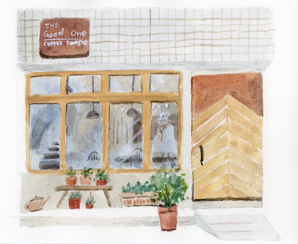
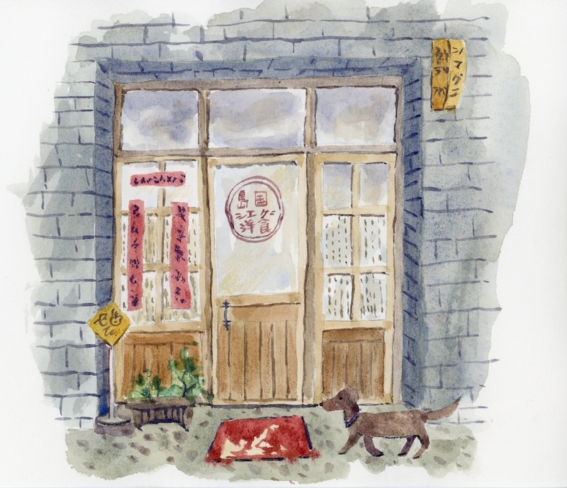
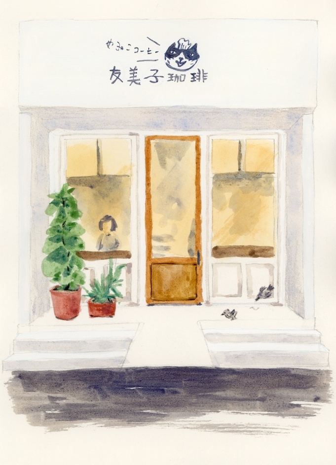
Then, as I painted, I started to reflect and explore the concept of ‘balance.’ With Deer’s guidance, I completed these three small shop illustrations. Before painting, I observed the feelings the shops evoked and thought about what I wanted to convey about each shop. Since these are illustrations of real existing shops, I referenced the colors of the shop’s decor. While painting, I encountered some questions: For example, in the first illustration, the sign, door, and windows are all made of wood, using a brown color. But brown color comes in various shades—dark, light, with yellow or red undertones. How should I decide which color to use in which areas?
This is how I understand it. For a wooden coffee shop, if I first decide that the window frames should be a yellowish brown color, then the door should be a reddish brown color. If I also use a lighter color for the area above the door, the middle of the illustration would become a bit too monotonous, and the viewer’s attention might be drawn to the darker brown-colored sign instead. The deep-colored sign and the reddish brown on the wooden door balance each other out. The wall is white, and the interior is dark. The plants also have a mix of cool and warm greens. Similarly, for the restaurant where the walls are dark, I would avoid making the door and window sections too dark, to prevent the whole composition from feeling too heavy. The wooden door is a reddish brown color, while the doormat is a cool red. Essentially, by using a strategy of varying shades and warm and cool contrasts, while referencing the real-life colors, I make adjustments accordingly.
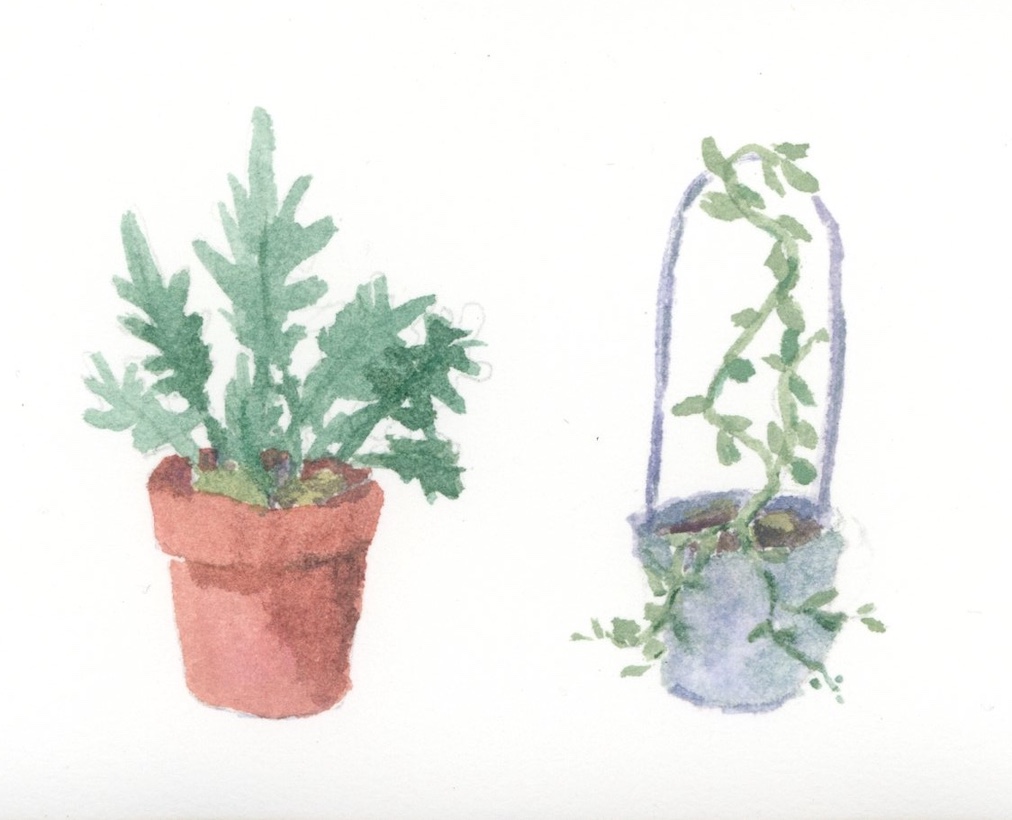
Later, I selected five photos from my travel pictures to paint. These were all photos I took because they resonated with me, yet they ended up being stored away in a small drawer on my hard drive and were never looked at again. Through painting, I was able to take a closer look and appreciate them again. I also unexpectedly discovered the stories the houses themselves tell. Below are some more examples, in hopes of gaining a better understanding of the concept of color balance.
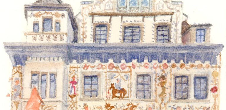
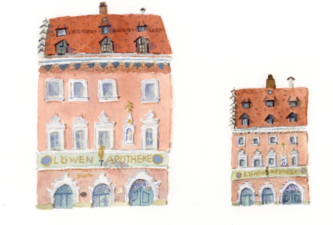
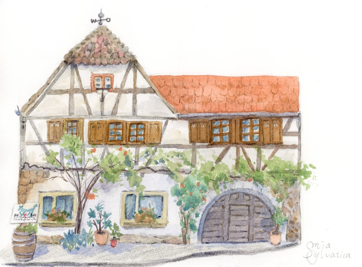
Now, we have to apply the knowledge we’ve learned in class and figure out a color strategy ourselves! Taking the Lion Pharmacy on the bottom left as an example, I really like the romantic color palette of the building, so throughout the process, I made sure not to let the colors become muddy or dull, and avoided using overly saturated colors. There are three techniques in watercolor that help keep the colors from being too overpowering. First, slightly mix in complementary colors. Second, dilute the paint with water. Third, add some opaque white gouache. Here, I used a little white gouache to make the colors soft pink, light green, and light blue. One thing I hesitated about was the gray-blue in the shadow areas – should I choose a cool blue or a warm blue? I eventually chose cool blues like Azurite Blue or Cerulean Blue, rather than warm blues like Ultramarine. The reason is that the overall wall, roof, and sign lettering are warm tones, so I opted to add some cool blue to create balance. Of course, some illustrators may choose to go fully warm, and I think that’s fine, too, because that’s also an expression. Maybe it reflects an artist’s inner passion and intensity. Since the walls are soft in feel, I made the roof a darker color to create some contrast and layers. Similarly, I applied this strategy to the Fox Nest Restaurant on the right. I kept ‘balance’ in mind the whole time, continuously evaluating the current state of the artwork and then deciding on the colors. That’s why I worked slowly. Every time I paint, it feels like playing a puzzle game. Within certain constraints, I find solutions, ways to present the scene, and make decisions.
Join the free member on Patreon to see: Painting Process|Löwen Apotheke
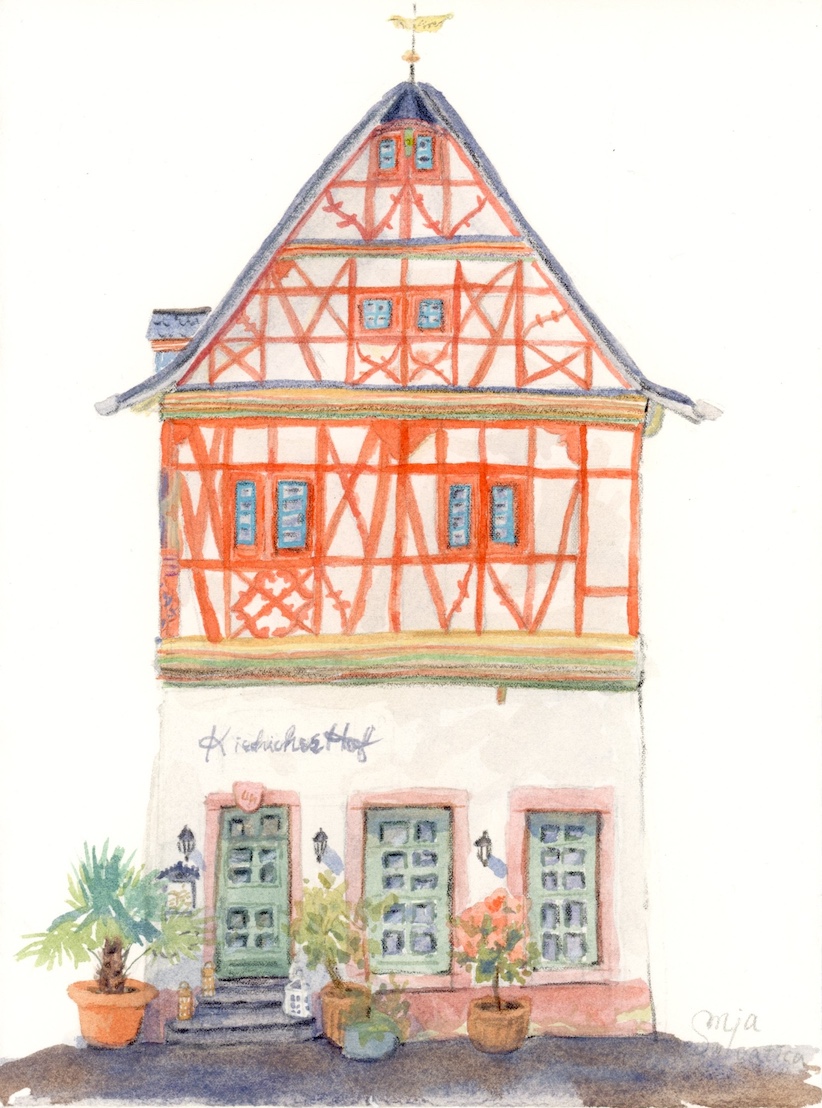
For the timber-framed house in the bottom left image, I used a fairly vibrant orange-red, which kept the original impression I had of the building. Since it was sunny that day, I naturally chose brighter, more saturated colors. For the ground floor, I used a diluted cool red and softer pink. While the focus of the viewer is on the prominent upper wooden frame, the added weight at the bottom keeps the entire composition from feeling top-heavy and unbalanced. It’s like one person is joyfully about to fly to the sky, but another person is holding onto their legs to keep them grounded.
On the right, the ground floor of the shop presented a color I struggled with: a muddy deep earth yellow. Although the actual shop was closed that day, so the ground floor was very dim and the walls were old, with large red framed lines. I later reassured myself that although it’s an earthy yellow, yellow and green are analogous colors that create harmonious combinations, so I didn’t need to be too afraid of it. I aimed to maintain a certain brightness on the ground floor. My adjustment was to tone down the bold red lines and differentiate the two doors and the window in the middle with varying shades and warm-cool contrasts of brown. I kept the light in the window fully on to make it brighter, creating a connection with the upper floor, so it wouldn’t feel split into two parts. For the upper floor, I used pink to create a cute feel and added some blue or cool yellow accents to maintain balance.
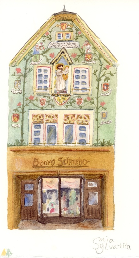
For the darker areas in this painting below, I didn’t make them too deep, instead using a more comfortable gray-blue as a substitute. From the base color to the decorations on the walls, I kept paying attention to the balance of warm and cool tones. Although orange and blue are complementary colors, through adjustments, I was able to create a softer feel rather than a strong contrast.
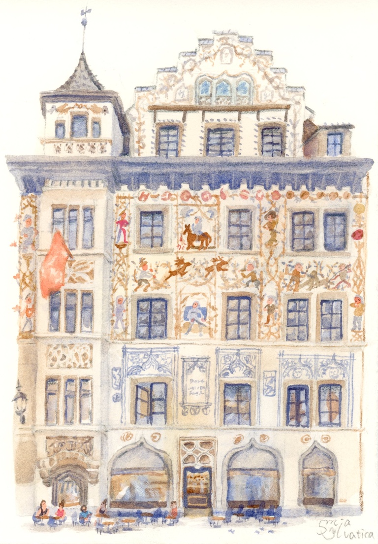
After looking at so many examples, do you have a clearer idea about color selection now? I think we can think of every element in the scene as a member of an orchestra. Each instrument, at what moment, how loud or soft it should play — it’s up to you as the conductor to make the music sound harmonious. In summary, to achieve a balanced color scheme, you need to constantly observe while painting and make appropriate adjustments based on the hue, warm and cool tones, lightness and darkness, and saturation. The above method refers to color selection based on real-life colors. In the world of illustration, there’s also a situation where we don’t use realistic colors, meaning we don’t always have to replicate the colors we see in everyday life. We can limit the number of colors used in an illustration, such as two or three colors. But Deer’s concept of balance still applies here.
Welcome to subscribe to the Blog for free! New articles about painting and the aesthetics of life will be sent directly to your inbox! (You can unsubscribe at any time.)

